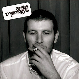
 This is the album 'Whatever People Say I Am That's What I'm Not' by Arctic Monkeys. The album cover is very famous and is instantly recognised, although the album cover does not feature the album name on the cover the band name is written in a bold text in the top corner. The photograph used for the album is very simple yet iconic; a man is smoking a cigarette and looking fairly satisfied. He is sat in front of what appears to be a curtain and wearing a basic plain shirt. The mise-en-scene of the cover photo is not extravagant and does not appear to be very exciting as it is extremely plain. However, the use of a medium close up shot adds impact to the image as it foregrounds the man in the photograph, this allows the audience to see closely the man and receive an idea of the band's identity. The image creates realism as there is no abstract elements to this image which allows the audience to relate to the main featured on the front cover. In terms of class, the man is portrayed as working class seen through the use of props as he is smoking which is considered a stereotype of the working class. Immediately this creates an identity for the band who are displaying themselves through the front cover of their debut album; they too are working class and aren't portraying themselves as something they are not which links in with the album title. There is also a theme of black and white as both the photograph and the band logo follow this colour scheme; this adds a vintage look but also connotes that the band are represent themselves in black and white, showing that they are who there are and that only. The band breaks formal conventions by not placing the album title on the cover, although this is viewed as an essential part of an album as it catches the attention of audiences this album focuses fully on the image. The image is very unique in comparison to others as they usually feature the band members on the front, this way the album is individual and will catch people's eye, intriguing them and encourage them to find out more about the band.
This is the album 'Rumours' by Fleetwood Mac. This album cover is also simple yet effective; this album cover features two members of the band which will draw the attention of present fans of the band as they will recognise them. To also appeal to fans, the album cover has the name of the band printed at the top in a fancy text. Beneath the band name is the title of the album using the same text which reinforces the genre convention of the album which creates cohesion of the appearance of the album. The font used for the text is linked to the genre conventions of the music; Fleetwood Mac are a rock band who also come under the genre of blues and rock blues. Due to this, the font is expected to be a very subtle, fancy text and not something really bold and harsh. Furthermore, in terms of mise-en-scene the costume of the band members also appears to be fancy and expensive. The woman is wearing a long silky dress with a chiffon type shawl which are known to be luxurious types of clothing yet she is also wearing ballet shoes which fits in well with the conventions of music as music and dance is strongly connected. The man is wearing a white shirt with a waistcoat which appears to be formal to match the woman's outfit. Next, the image is in black and white which gives the photograph a vintage look whilst foregrounding the image against the plain, pale backround.
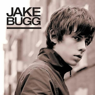
 This is the self-titled album 'Jake Bugg' by artist Jake Bugg. The album cover features the artist himself on the cover which follows formal conventions and ensures that the soul focus of the album cover is Jake Bugg. Depth of field is used in the photograph which creates a large impact on the audience as this foregrounds teh artist which is the man purpose of the album cover. The audience expect to see the artist and for them to be on the front cover as this along with the actual music is the audiece's main interest. The background of the image contains different bulidings which makes is apparant that the photograph was taken down a street. This is very similar to the music video 'Lightning Bolt' as the majority of it is filmed down busy high streets. The expression on Jake Bugg's face is quite solemn which refelcts Jake Bugg's personality and album.
No comments:
Post a Comment