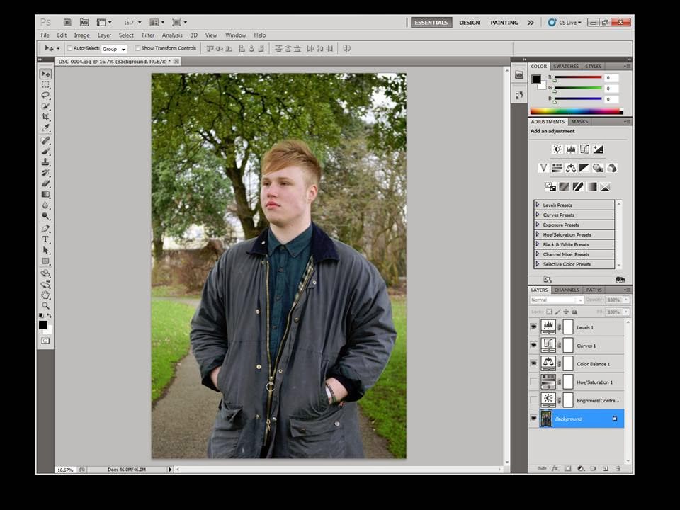
This is the first step I took whilst editing which consisted of adjusting the levels by changing it to Auto, this corrected the lighting.
Next, I moved onto adjusting the curves to that the details of the tree and Freddy's jacket were more prominent.
I then used the colour balance tool to emphasise the green colours of the trees and grass in the background of the image.
Next I used the hue and saturation tool to make the mood more meloncholic as the music video shares this mood as opposed to bright happy colours that a pop CD may use for the album cover.
After this, I moved onto the brightness and contrast. This helped me emphasise the image by increasing the contrast which made Freddy stand out against the busy background.
Next, I decided to add a noise effect to achive a grainy, film look which I found was common genre convention as this added a vintage, rock and roll mood to the image.
This is the final edited image, although it is simple I wanted to see what effect I could create whilst avoiding using the black and white tool so that I have a range of images that I could use for my advertisement.


No comments:
Post a Comment