Friday 2 May 2014
Wednesday 30 April 2014

Tuesday 29 April 2014

Sunday 27 April 2014
Saturday 26 April 2014
Friday 25 April 2014
Evaluation Question 3: What have you learned from your audience feedback?
Audience Feedback for 1st Draft and Final by lydiaamarie on GoAnimate
This is an example of the quantitative data that I received concerning my final draft for my music video.
1. Do you think the music video belongs within the indie genre?
10/10 people answered YES.
This is extremely important as the music video needs to be recognised as belonging to the indie rock genre. The feedback informs me that I have been successful within my aims to appeal to my target audience of indie rock fans as they are able to consume the product as something which they can relate to.
2. Do you understand the narrative?
9/10 people answered YES however 1/10 people answered A LITTLE
Although it is not very good that one person did not completely understand the narrative, I have not been disheartened by the results as the dominant answer was YES, therefore most people are able to understand the narrative of the video which will make the video entertaining and effective through the success of the portrayal of the narrative.
3. Does my music video match my ancillary texts?
10/10 people answered YES
I am very pleased with this outcome as it is important that all three media products can be matched together as they are all promoting the same artists and song. A major aspect of promotion being a success is for a strong identity to be created for the artist, as all of my ancillary texts can be linked together it is sure that the identity for the artist will be well promoted.
4. Are there any improvements to make?
10/10 people answered NO
This is a good result as I did not want to find out that people thought that there were lots of improvements as this reinforces the realism and professional effect of the music video.
5. Would you watch the music video again?
10/10 people answered YES
Finally, this is a very successful outcome as the aim of my music video was to appeal to my target audience, entertain and also promote the artist. As all of the people asked this question answered YES, it reassures me that I the music video fulfills its purpose and represents itself as realistic music video which professional qualities.
Music Video First Draft Qualitative Data
Digipack Front and Back Cover & Magazine Advertisement Quantitative Data
Music Video Final Draft Qualitative Data Audience Feedback for new editing effects by lydiaamarie on GoAnimate
This is a focus group I filmed of two media students watch my final music video and giving me audience feedback
Sunday 6 April 2014
Friday 4 April 2014
Should I display the artist's name or not?

 After getting some audience feedback, I have decided to stick with my 3rd CD front cover draft. This was the most popular, despite the fact the 4th cover included the artist's name which is a convention of the form. However, not all album covers feature the artist's name such as the album 'Loud' by Rihanna. This implies that because she is such an iconic artist, people will immediately recognise it is her and therefore there is no need to state it. I wanted to use this idea as well as use a minimalistic structure to ensure the image was the man focus of the album cover.
Possible Final Digipack


Getting Audience Feedback

I also created a questionair for feedback on my first draft which I gave to people after they watched my video to fill in.
Thursday 3 April 2014
Wednesday 2 April 2014
Ancillary Text Audience Feedback


I created a table where people could tally which draft was their favourite for my magazine poster and front and back cover for my CD.


Tuesday 1 April 2014
Ancillary Text: Album Front and Back Cover 2nd Draft


- track list
- barcode
- record label logo
- placement of the image to ensure the track list is readable
The changes follow formal conventions as on the back covers for albums the audience will expect and want to see what songs are on the album. I think it is important to include this feature to ensure it looks realistic and stands out as the back cover. The font I used was called AR Darling from Photoshop which coincided with my theme as I have tried to use an alternative bold style. However I had difficulty with making sure the track list was easy to read due to the background of the image as it is very busy and the black font on the black image made it unable to read. This is why I decided to move the main image to the right, giving space for the track list to be displayed against a plain background. Although this does not necessarily fit into formal conventions, I like the way it looks as it is unique and helps foreground the track list. It also ensures that the back cover it not too busy and complicated and highlights the image of the artist. Next, I added an image of a barcode to fulfill more formal conventions and the record label logo I created for my own brand to add to the formal conventions. I am very pleased with the outcome of this draft as I think it is a big improvement from my last draft however I may create another draft using a different editing style to the main images as the Threshold effect could be something which may not appeal to my target audience.
Ancillary Text: Poster Advertisement 3rd Draft
 This is the third draft I have created for my magazine poster advertisement which I quite similar to my 2nd draft but with some improvements. I am very happy with the outcome of this draft as I feel that this advert looks the most realistic and follows both conventions of the form and genre. The changes I made were:
- the placement of the masthead and previous titles
- the size of the image, I have used a black background for the majority of text to foreground it
- new conventional titles
- added promotional brands and artist's website
Ancillary Text: Poster Advertisement 2nd Draft

- a different editing style for the main image
- different font for masthead and titles
- image of the album being advertised
- Twitter and Apple logo
The reason I made these changes were because I felt that my first draft did not look very realistic and I missed opportunities to follow formal conventions of a magazine advert. I think the changes I have made have improved the initial draft and make it look more professional. The main image I used is the same as the initial image used in the first draft however I chose to use a grainy noise effect rather than the horizontal stripes used before. This is because the noise effect has connotations of a vintage film which is an effect I hope to achieve in my music video which will create cohesion between both products. Also, I found that the font was able to be bolder using this effect which is important as it needs to be able to catch the eye of my audience. Secondly, I decided to use two different fonts that I did not use in my original draft as it on my original I had to ensure I had a black background used in any place for the font as I used the Invert tool on Photoshop to change the font colour from black to white to ensure it was readable on my advert. Although this helped create a border for my main image which stood out, it was very inconvenient. Also the masthead title from before was in a graffiti style font which can be more commonly used for hip hop magazines which does not fit in with my genre. The fonts I decided to use for my 2nd draft fit in with genre conventions and also compliment the album cover image as both are bold and black and white. Next, adding the image of my album front cover appeared to be a necessary convention as the magazine is to advertise the product and therefore that is what the audience expect to see. I think this immediately alerts the audience that it is specifically an album advertisement rather than just an advert about them or any concerts. Finally, the Twitter and Apple logo I used just to add a realistic convention as during my research I found that many adverts used social media icons or shopping brands to advertise the artists own social media or where the audience are able to purchase the album. I am happy with how both logos fit in with my black alternative theme however they are not very noticeable which is something I intend to change.
Plans to Add Vintage Effect
I would like to achieve a vintage effect for the flashbacks in my music video to reflect that the scene are from the past, it is also one of the genre conventions.
These are some videos which use a film effect which creates the idea it has been filmed on a old film camera which shows lines are some dark scratches.
 This is a The Stone Roses music video for 'Love Spreads' which throughout uses a film effect. The image (left) is a snapshot taken from the video, it has very faint lines and scratches on it which makes it look very old and vintage styled. Furthermore, The Stone Roses are a 90's 'Madchester' band who also belong to the alternate indie genre and therefore I feel confident that using the same/simlar effect will fit in well with the genre conventions.
https://www.youtube.com/watch?v=ct-qa6SjRZo
 This is a snapshot from Arctic Monkeys' 'The
Hellcay Spangled Shalalala' which also uses a black and white film effect. Although I don't plan to use the film effect on my black and white shots, I think it will fit in with my music video. In the music lots of shots including this snapshot (right) alos used a grainy effect which I think works well with emphasisng the vintage tone.
https://www.youtube.com/watch?v=dAlRXC19hmE
 Thirdly, this snapshot is from The Cure's music video for their single 'Pictures of You'. There is some very complex editing used in this video however there are some shots which use a film effect along with a hand held technique which helps create the idea it was filmed with a film camera. This used the same effect as the 'Love Spreads' music video as it has lines and scratches on certain shots whilst using a grainy effect like the 'The Hellcat Spangled Shalalala' video. I think if I achieve an editing effect like this it will work well with my video because some of my shots use a hand held technique also.
https://www.youtube.com/watch?v=UmFFTkjs-O0
I have arranged for the IT Expert to show me how to apply this effect to my own music video using the Editing Suite as I am unsure how to do it myself which will help me learn more editing techniques and ensure that it is done to a good quality for my music video.
These are some videos which use a film effect which creates the idea it has been filmed on a old film camera which shows lines are some dark scratches.
https://www.youtube.com/watch?v=ct-qa6SjRZo
Hellcay Spangled Shalalala' which also uses a black and white film effect. Although I don't plan to use the film effect on my black and white shots, I think it will fit in with my music video. In the music lots of shots including this snapshot (right) alos used a grainy effect which I think works well with emphasisng the vintage tone.
https://www.youtube.com/watch?v=dAlRXC19hmE
https://www.youtube.com/watch?v=UmFFTkjs-O0
I have arranged for the IT Expert to show me how to apply this effect to my own music video using the Editing Suite as I am unsure how to do it myself which will help me learn more editing techniques and ensure that it is done to a good quality for my music video.
Feedback from Teacher
I have shown my first draft to my teacher Becky to get some helpful feedback so that I know what steps I need to take next in terms of editing my video.
She said:
She said:
- she liked my editing
- she enjoyed my video
- there are not any major improvements I need to make
Monday 31 March 2014
Record Labels


Thursday 13 March 2014
First Draft Audience Feedback

 I created a questionaire and conducted some audience feedback by getting people to watch my music video and answering the questions. The questions included were:
-Do you think the music video belongs within the indie rock genre? Why?
-Do you understand the narrative of the video? How well do you feel this was conveyed?
-What do you think of the editing? Does it work well with

 the mood of the song?
-Does my music video match with my ancillary texts?
-Are there any major improvements I could make?
-Would you watch this video again? Why?
I think these questions were very helpful in terms of acknowledging what stage I was at in terms of finishing my music video. They have helped me understand that there isn't anythig that needs dramatically changing however I do still want to add a film effect onto my final draft as I think this will help convey the narrative more.


Tuesday 11 March 2014
Music Video First Draft
I am pleased with my first draft as I feel I have achieved the look I wanted to already and set the scene for the narrative. I am pleased with the editing I did however I am aware that there are still a few changes I would like to make as well as re-shooting some shots for example the two shot of Freddy and James smoking and the pan across the pillows to Sophie's face. The two shot of Freddy and James may need to be re-shot as James looks at the camera and I didn't film for long enough and therefore when it came to editing I had no option but to slow the speed down to make the shot long enough as I regretably didn't do more than one take. To improve the shot whilst making sure I do not have the planning problems I had when trying to arrange a day to shoot, I could use of close up shot instead of Freddy's mouth smoking as this would be easier to arrange due to the close deadline however I could re-film the original shot for longer and without James looking at the camera. Next, the pan shot I feel is actually too long, I believe it would look better if I added in a different shot before the pan shot to reduce the time of the pan shot. Overall, I am pleased with the outcome of my first draft but I am also thinking of improvements I could make to my music video and need to make a start in getting my audience feedback.
Monday 24 February 2014
Album Front & Back Cover Inspiration
The inspiration for the editing style of my front and back cover for my 1st ancillary text draft are the album covers:

 They each use a cartoon style image which creates a unique appearance and instantly catches the audience's eye. This is because it breaks the formal convention as usually a photograph is used rather than a drawing which is how the front cover appears. Lots of drawings are used for indie rock album covers as this adds to the unique style and fits in with how indie genre likes to appeal artistically and look aesthetically pleasing.
 Although I thought it would look very creative to recreate this style, I didn't intend on actually trying it as I didn't feel that I would be able to create a drawing or painting which I could use for the front cover. It seemed that the best option would be to opt for using photographs as I already have experience using Photoshop. However, whilst I was practising different effects using the photos I took, I found an interesting effect called Threshold which created a similar effect to the black and white, Sonic Youth - Goo album whilst maintaining a cartoon-like style seen by the Peter, Bjorn and John - Young Folks single cover.
- Sonic Youth - Goo
- Peter, Bjorn & John - Young Folks
They each use a cartoon style image which creates a unique appearance and instantly catches the audience's eye. This is because it breaks the formal convention as usually a photograph is used rather than a drawing which is how the front cover appears. Lots of drawings are used for indie rock album covers as this adds to the unique style and fits in with how indie genre likes to appeal artistically and look aesthetically pleasing.Although I thought it would look very creative to recreate this style, I didn't intend on actually trying it as I didn't feel that I would be able to create a drawing or painting which I could use for the front cover. It seemed that the best option would be to opt for using photographs as I already have experience using Photoshop. However, whilst I was practising different effects using the photos I took, I found an interesting effect called Threshold which created a similar effect to the black and white, Sonic Youth - Goo album whilst maintaining a cartoon-like style seen by the Peter, Bjorn and John - Young Folks single cover. Sunday 23 February 2014
Filming Day #4
Today was the final say of filming, I had a lot of problems with arrangements and ended up replacing one of my original actors whilst another character in my video had to be dropped as I was unable to replace them however I am still pleased with the outcome of today's filming. All of the shots were located in Old Town in Hull as I wanted an old indie mise-en-scene which I found in Old Town. I feel that despite the difficulties I found with arrangements etc. the overall shots were good although there are a couple which may have to be re-shot. However, I am pleased with all of my filming and look forward to editing my video and finding out how well the filming has worked.
Wednesday 19 February 2014
Filming Day #3
Today's filming consisted of getting the final shots of Sophie in the music video of her by herself located in my house and down some streets. I only had 8 different shots to shoot which were located in my house and down a few different local streets to vary the locations I include in my music video. I feel the filming was very succesful and I achieved all the shots I wanted to, it was filmed within a small amount of time as the shorts were relatively simple which was very convenient and arranged well as all of the shots were ones I could film locally.
To keep a cohesive mise-en-scene in terms of costume, I kept Sophie's costume the same as previously filmed in Pearson Park as all of these shots are supposed to be from the same day. I got Sophie to apply the same make-up as before to ensure continuity.
To keep a cohesive mise-en-scene in terms of costume, I kept Sophie's costume the same as previously filmed in Pearson Park as all of these shots are supposed to be from the same day. I got Sophie to apply the same make-up as before to ensure continuity.


Friday 14 February 2014


Thursday 13 February 2014
Monday 10 February 2014
Ancillary Texts: 3rd Poster Edit Photo
This is the previous, noise image that I edited however I have changed it to black and white which I feel looks as though it belongs more to the indie rock genre. Whilst I changed it to black and white, I adjusted the brightness of the main colours in the photograph. I made sure that the greens were increased as to hihglight the trees in the background and increased the cyans and blues as this is the colour of Freddy's clothes and I wanted them to contrasts against his light skin.
Ancillary Texts: 2nd Poster Edit Photo

This is the first step I took whilst editing which consisted of adjusting the levels by changing it to Auto, this corrected the lighting.

Next, I moved onto adjusting the curves to that the details of the tree and Freddy's jacket were more prominent.

I then used the colour balance tool to emphasise the green colours of the trees and grass in the background of the image.
Next I used the hue and saturation tool to make the mood more meloncholic as the music video shares this mood as opposed to bright happy colours that a pop CD may use for the album cover.

After this, I moved onto the brightness and contrast. This helped me emphasise the image by increasing the contrast which made Freddy stand out against the busy background.

Next, I decided to add a noise effect to achive a grainy, film look which I found was common genre convention as this added a vintage, rock and roll mood to the image.

This is the final edited image, although it is simple I wanted to see what effect I could create whilst avoiding using the black and white tool so that I have a range of images that I could use for my advertisement.

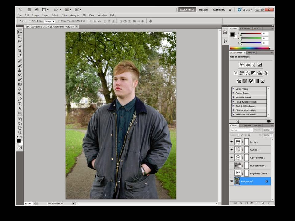
Ancillary Text: 1st Poster Edit Photo
This is the original photograph opened up on the editing software Photoshop.
 Firstly, I adjusted the levels by setting them to Auto which meant that the lighting was set to the lighting of the photograph when it was taken. This meant that the colours also look more realistic to the original setting.
I next moved onto changing the photograph to black and white as this is a genre convention I found when researching into original CD covers. This gave the photograph a much stronger indie genre vibe as it makes the photograph look rather vintage.

Next, I slightly adjusted the curves to increase the shadows in the photograph and to highlight the lighter parts of the photo such as Freddy's face. This ensures that the artists stands out whilst maintaining a dark, tough portrayal of the artist.

After this, I increased both the brightness and the contrast to further the impact of the details. Although thsi only made a small difference, I think it is necessary to experiment with different tools to see what can be achieved.

Finally, I adjusted the exposure of the image to bring attention to Freddy's face by lightening it. This makes emphasises the idea the Freddy, as the artist, is the focus of the advertisement.

Firstly, I adjusted the levels by setting them to Auto which meant that the lighting was set to the lighting of the photograph when it was taken. This meant that the colours also look more realistic to the original setting.I next moved onto changing the photograph to black and white as this is a genre convention I found when researching into original CD covers. This gave the photograph a much stronger indie genre vibe as it makes the photograph look rather vintage.
Next, I slightly adjusted the curves to increase the shadows in the photograph and to highlight the lighter parts of the photo such as Freddy's face. This ensures that the artists stands out whilst maintaining a dark, tough portrayal of the artist.
After this, I increased both the brightness and the contrast to further the impact of the details. Although thsi only made a small difference, I think it is necessary to experiment with different tools to see what can be achieved.
Finally, I adjusted the exposure of the image to bring attention to Freddy's face by lightening it. This makes emphasises the idea the Freddy, as the artist, is the focus of the advertisement.
Subscribe to:
Posts (Atom)